This Space Available
By Emily Carney
Forget debates such as “Shuttle or Apollo,” “ISS or Space Station Freedom,” and “Falcon Heavy versus Space Launch System.” One of the biggest debates in human spaceflight is still “Meatball or Worm.” And if you know what I’m talking about…you know what I’m talking about. This ongoing debate began during the early 1970s, when the U.S. government was searching for ways to “beautify” and modernize their agencies’ logos. The result has divided space enthusiasts – and even some of the agency’s astronauts – for over 45 years.
One logo that fell under scrutiny was the NASA “Meatball.” According to NASA, “The round red, white and blue insignia, nicknamed the ‘meatball,’ was designed by employee James Modarelli in 1959, NASA’s second year. The design incorporates references to different aspects of the mission of the National Aeronautics and Space Administration. The round shape of the insignia represents a planet. The stars represent space. The red v-shaped wing represents aeronautics. The circular orbit around the agency’s name represents space travel.” This logo is most popularly associated with NASA’s Mercury-Gemini-Apollo era from 1959 through 1972, and is the one we see in iconic films such as Apollo 11. Seeing it conjures memories of early spaceflight, and the shadowy, almost eerie visions of humans walking upon the Moon. It’s 1960s nostalgia embodied in one compact logo, a perfect fit on a circular spacesuit patch, or a fun button to be attached to a backpack.
While there was arguably nothing wrong with the NASA “Meatball” logo, according to a Creative Review article, under the Nixon presidency the U.S. Federal Design Improvement Program set out to usher government logos into new times, and new adventures: “…more than 45 federal agencies, including The Department of Agriculture and The National Zoo, had their graphics critiqued and redesigned: New York design studio Danne & Blackburn was tasked with the job of [modernizing] NASA’s logo.” By the mid-Seventies, the Space Shuttle program was being developed, exciting new payloads – including a state-of-the-art Space Telescope – were being designed, and the as-yet-unveiled logo would have to reflect NASA’s entry into the 1980s and beyond.
Thus the ubiquitous “Worm” logo was born. Richard Danne, design director for the project, was quoted in Creative Review as stating, “…it was clean, progressive, could be read from a mile away, and was easy to use in all mediums…This [was] a coordinated, comprehensive design programme, not just another ornamental badge to be stuck on a multitude of different products.” Indeed, NASA’s Graphics Standards Manual, released in January 1976, showed the streamlined, slick logo on an array of media, including but not limited to agency vehicles, spacecraft, stationery, and publications. In addition, elements such as fonts were standardized. One of the most common fonts used by NASA, post-1976, was Helvetica, a minimalist sans serif font that paired well with the new logo. Space Shuttles’ names painted on the side of the vehicles’ crew cockpits – starting with Enterprise – would be in Helvetica. There were examples (and non-examples) provided of how to use the logo, and color swatches were provided so graphic designers could get a perfect color match to the logo’s suggested Warm Red or Warm Gray color. (There was briefly an idea to standardize Shuttle crew patches, but that’s a separate article for another time.)
Ironically, the Shuttle-ready “Worm” logo was rolled out during Apollo’s swan song, July 1975’s Apollo-Soyuz Test Project mission. However, not every Apollo-era astronaut reflected back upon the early “Worm” era with fondness. One astronaut from that era stated: “In my view, and that of most others I knew, the ‘worm’ logo was about the dumbest idea imaginable. Seems it was imposed despite NASA’s most successful, challenging, and history-making era to that date. I guess the worm was to signify a ‘new beginning’ with plans to fly the future Space Shuttle several times per month. Instead, the Shuttle was delayed several years, and it finally took a fatal accident [1986’s Challenger disaster] to replace the worm logo with the original ‘meatball’ logo. I think the worm was created and unveiled by new upper NASA HQ management that had little to do with Apollo, and certain folks wanted to make their ‘mark’ as inventors of a new NASA era.”
Dr. Ed Gibson, who briefly left NASA in 1974 but returned to the astronaut corps later in the decade, gave his thoughts on the “Worm”: “When the worm was introduced, it was to move NASA into the modern era. Most us thought it was interesting, but would surely be replaced with next fad in a few years. We all missed our beloved NASA Meatball, and were happy when it was pulled out of its grave to reign again!”
Indeed, by 1992 the “Worm” – at least for a time – was deemed verboten by the same agency that had championed it circa 1976. Again, from the Creative Review article: “According to NASA’s new administrator at that time, Dan Goldin, the worm was disliked by the agency’s employees and complaints had been received about the logo’s ‘incompetence and lack of projection.’ However, some argue that Goldin was motivated to make the change by more than just design aesthetics. According to Bert Ulrich of NASA’s Public Services Division, older members of staff at NASA remembered the old meatball insignia with fondness as it represented NASA in the Apollo days, before the 1986 Space Shuttle tragedy. The Newport News Daily Press suggested in an article published on May 23, 1992 that Paul Holloway, then director of NASA’s Langley Research Center, may have dealt the death blow to the worm in a conversation with Goldin. ‘You know how to lift the morale of NASA?’ Holloway reportedly asked Goldin. ‘You can do it by changing the worm.’”

For nearly 30 years thereafter, the “Worm” was revered with nostalgic longing by many space enthusiasts who fell under the “Generation X” age group; after all, those born between the mid-1960s and early 1980s were the ones who watched NASA programs on grainy television sets that opened spectacularly with the “Worm” logo, and saw the logo in countless space photos and/or books.
But by 2020, something shifted. Under then-administrator Jim Bridenstein, who was born a month before Apollo-Soyuz launched in 1975, the “Worm” made a comeback – this time, proudly alongside the “Meatball.” The “Worm” logo even made an appearance during the first crewed SpaceX Dragon launch in May 2020. At present time, The Space Shop at Kennedy Space Center Visitor Complex boasts many T-shirts and jackets featuring the “Worm” logo, front and center.
While it’s not always the most “loved” logo, NASA’s mid-1970s “Worm” embodied the hopes, dreams, and excitement of a certain era. For many of us, this sleek logo was the one most associated with the early Shuttle era, when possibilities seemed limitless.
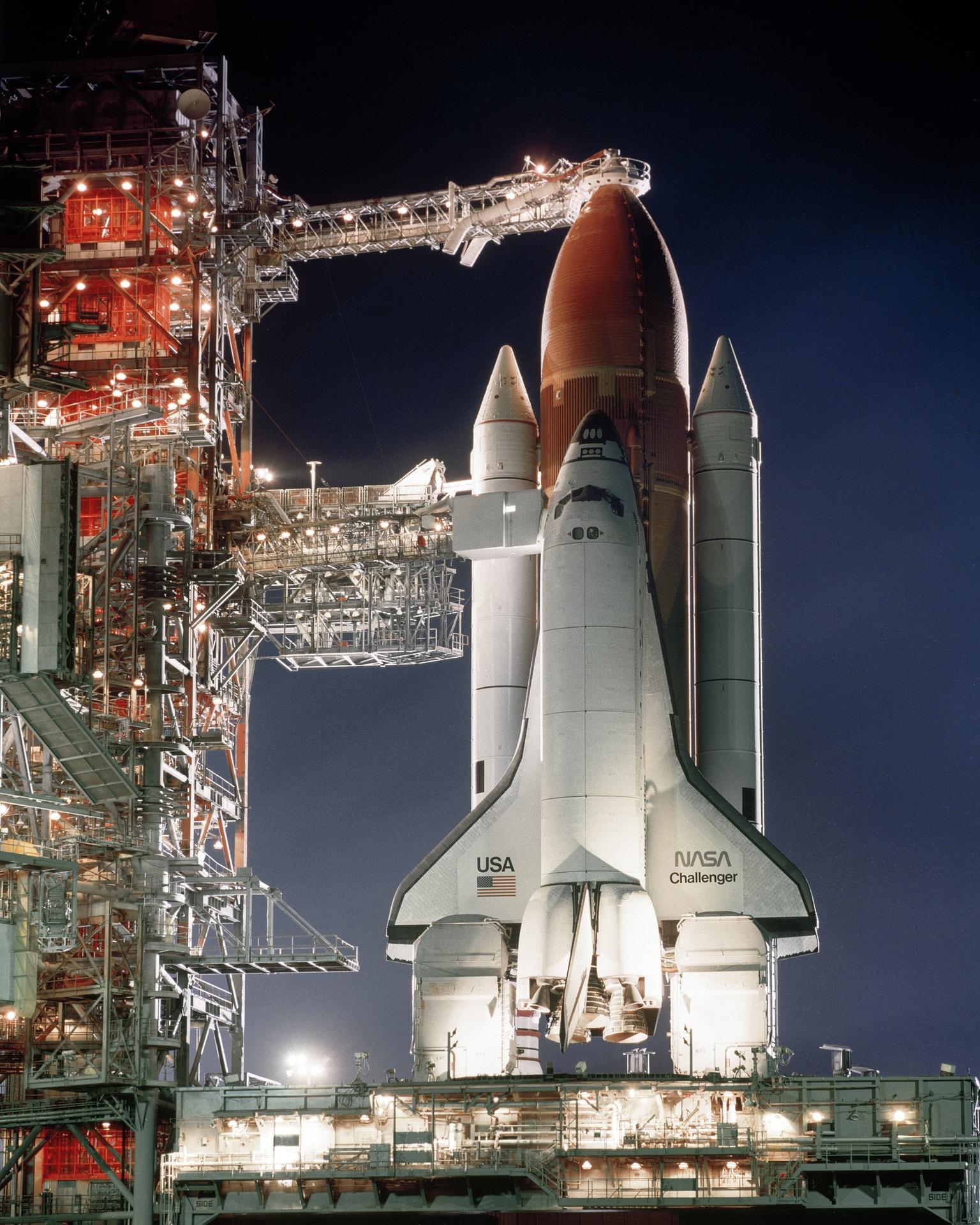
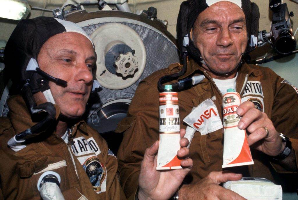
Featured Photo Credit: “AST-03-175 (17-19 July 1975) — Astronauts Thomas P. Stafford (left) and Donald K. Slayton hold containers of Soviet space food in the Soyuz Orbital Module during the joint U.S.-USSR Apollo-Soyuz Test Project docking mission in Earth orbit. The containers hold borsch (beet soup) over which vodka labels have been pasted. This was the crews’ way of toasting each other.” Slayton is sporting the new NASA “Worm” logo on his in-flight jacket.
*****
Emily Carney is a writer, space enthusiast, and creator of the This Space Available space blog, published since 2010. In January 2019, Emily’s This Space Available blog was incorporated into the National Space Society’s blog. The content of Emily’s blog can be accessed via the This Space Available blog category.
Note: The views expressed in This Space Available are those of the author and should not be considered as representing the positions or views of the National Space Society.